A mobile app that allows people with hypertension to track food choices and helps them adhere to the DASH eating plan
SKILLS: Interviewing, Affinity diagramming, User Journey Mapping, Prototyping, Usability testing
TOOLS: Adobe Photoshop, UXPin

obesity rates in the United States are rising. This leads to a higher prevalence of poor health outcomes and diet-related diseases, including hypertension, as well as increased medical spending. More must be done to address this growing problem so that medical spending can be reduced, and quality of life can be improved.
The Health eHeart study based out of UCSF aims to follow 1 million people through the use of mobile technology. Health eHeart hopes to collect and use enough data to develop strategies to prevent, treat, and manage heart disease. Additionally, the study is utilizing social media and technology to enroll participants and collect data.
Our team worked to develop the concept for an app that the Health eHeart research team can implement and distribute to cohort members. We sought to create something that would enable mobile technology to help people eat healthier and better manage their hypertension.
The DASH diet (Dietary Approaches to Stop Hypertension) is a flexible and balanced eating plan that has been found to be associated with reducing hypertension, weight loss, and improved health outcomes. Despite its effectiveness, physicians do not regularly recommend this eating plan because few people successfully adhere to this eating plan.
As part of the Eat.Think.Design. course with the School of Public Health at the University of California, Berkeley, we joined efforts with the Health eHeart research team during the spring semester of 2015 to ask: "How might we use technology in the form of a mobile app to help hypertensive and pre-hypertensive eat healthy diets?"
Prior to making any decisions about the app development, we wanted to better understand our client, the members of the Health eHeart Cohort. We developed an interview guide which asked nineteen open-ended questions about:
i) previous experience with healthy eating or dieting apps (i.e. Do you ever or have you ever used a mobile app to help track your diet or health behaviors? What did you like about it? What did you not like about it?);
ii) food shopping and dietary behaviors (i.e. What would motivate you to eat a healthier diet? When are the hardest times to make healthy choices?); and
iii) health management (i.e. Does your hypertension diagnosis change your daily habits?).
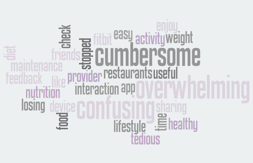
By and large, the respondents reported that the existing apps are useful for a short-term weight loss plan or learning about calorie content of foods. However, most people said that the apps are cumbersome, too confusing, and overwhelming.
To better understand the steps our users will go through in engaging with the app, we each created a user journey map.
We prioritized five areas when developing the prototype:
i) The onboarding process will collect general health and social network information about the user. Ideally, the app should link with the user's Health eHeart profile to minimize the burden of the onboarding process. Additionally, onboarding will include a brief educational module about portion sizes, the DASH Eating Plan, and the messaging within the app. This is when the user will learn more about the stoplight approach used in the second area of the app, the home screen.
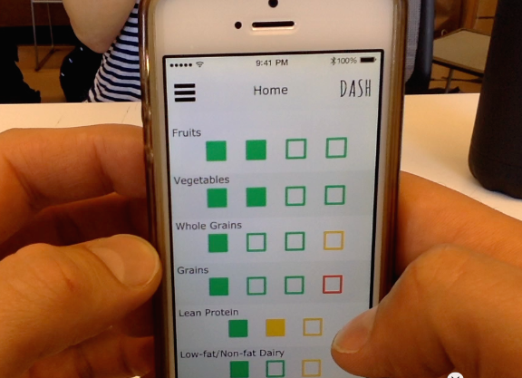
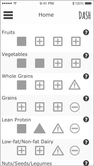
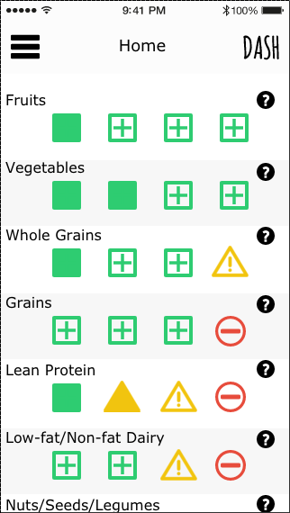
ii) The home screen is designed to be a simple and approachable mean for encouraging adherence to the DASH Eating Plan. Whereas other apps use a food-diary system of searching through a database to record the specific food items eaten at each meal, we altered the approach.
The home screen utilizes a check box design that aligns with recommended servings outlined by DASH.
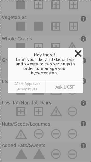
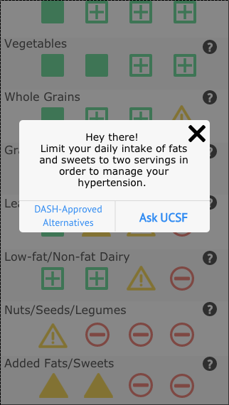
iii) We needed to develop a concept that would help users adjust their dietary choices, and adopt these healthier foods into their lifestyles. We included in our prototype little nudges that will help encourage the user to make healthy decisions.
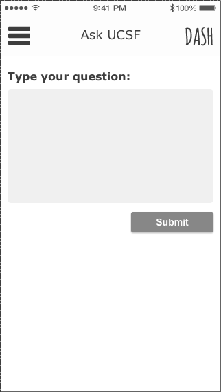
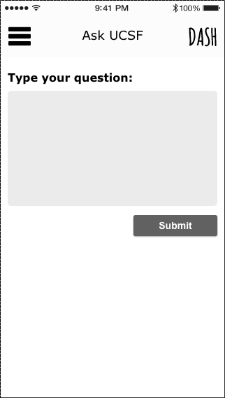
iv) We created a pathway for users to communicate directly with members of the research team via "Ask UCSF."
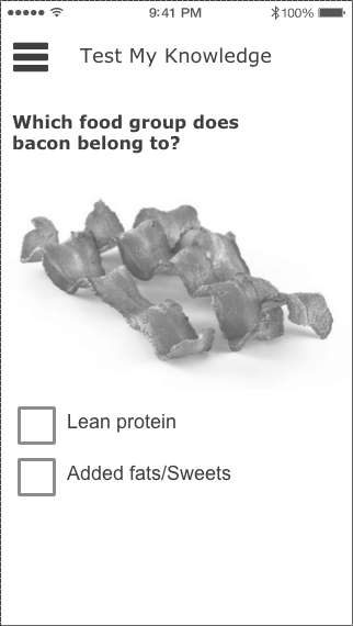
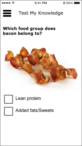
v) Finally, we integrated numerous opportunities for knowledge attainment and community building. There is a "DASH Information" page, which explains the various components of the DASH diet, such as specifics on what is meant by "Lean Meat" or suggestions for ways to incorporate whole grains into a diet. To reinforce this knowledge, we built a "Test My Knowledge" section to offer a fun way to quiz the user about tenants of the DASH diet.
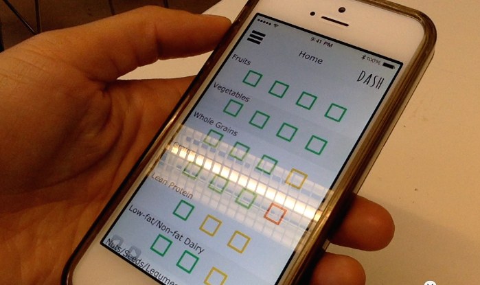





As discussed above, we developed a preliminary prototype of the app itself but have spent extensive time thinking through various components that future iterations should offer. We tested our prototype on peers as well as seniors, but we advocate for continued testing through the design process. We recommend that the researchers at UCSF incorporate these design suggestions into future iterations, while seeking continued feedback from cohort members to ensure that the product is in line with something that cohort members would actually use. Regardless of what features the final product includes, we believe this product is something that can change peoples' lives by enabling them to make healthier choices.