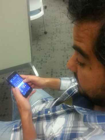
A mobile app that brings emotions to data by integrating users' photos with their physical activity data
SKILLS: Contextual inquiry, Affinity diagramming, Persona-based design, Storyboarding, paper prototyping, heuristic evaluation, Usability testing
TOOLS: Balsamiq Mockups, Proto.io
What are the pain points?
The project started by conducting several contextual inquires with people who engaged in Quantified Slef activities.
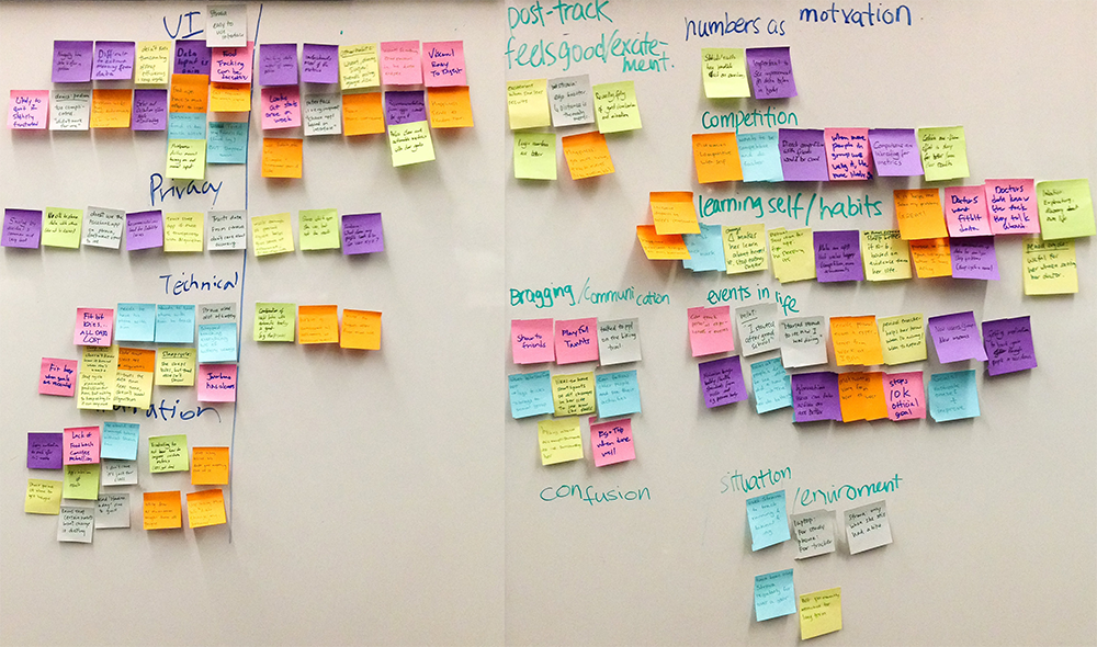
We conducted contextual inquiries to collect information about users with various levels of Quantified self activities. The observations were then used to gather the motivations and deterrents as to why they self-track through a group affinity diagramming activity.
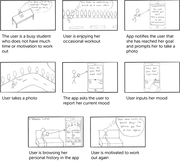
We created five user personas based on our findings from contextual inquiries. These user personas ranged on the number of activities they tracked and how frequently they engaged in self-tracking: beginner, spurter, experimenter, the extreme, and the athlete. We then created storyboards for possible use cases by each user personas.
After identifying the user needs and personas that would follow our concept, we brought our idea to life through creating a paper prototype. Paper prototype was a quick and easy way to get the concepts across and collect feedback.
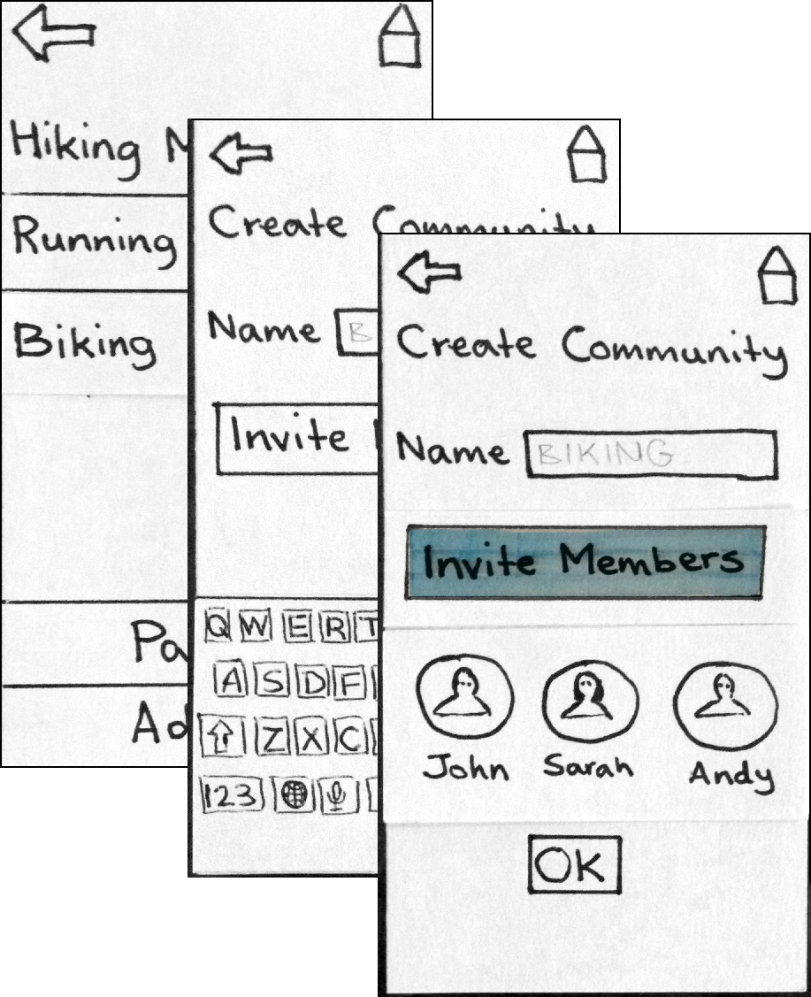
To satisfy heuristics for mobile applications, we used Balsamiq as our prototyping tool for the second iteration of the app. Since Balsamiq had many of the features identifiable in mobile apps, it helped us meet many of the consistency and standards of the heuristic evaluation.
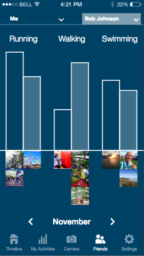
Based on the feedback from using the think-aloud method and heuristic evaluation of the Balsamiq prototype, we refined the application further to a more sophisticated level. In order to allow users experience how pix2bits feels as a mobile application and provide insightful input, it was created on Proto.io.
Due to limitations in Proto.io's logic, we had a workaround through the questions asked in the usability test. For example, the app was created to select as many self-tracking applications, however, we instructed users to pick one and inform us what others they would add through discussion.

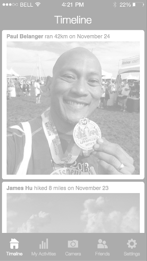
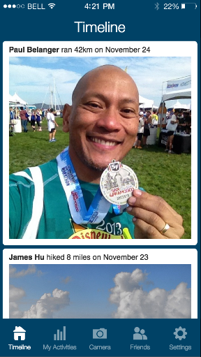


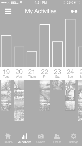
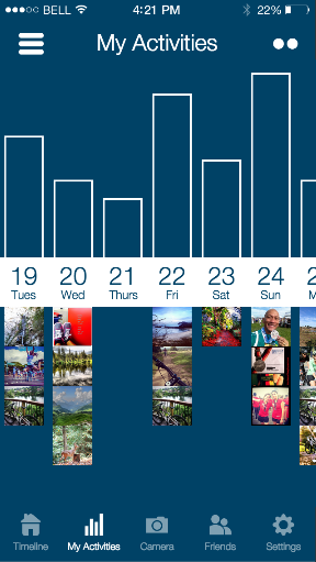


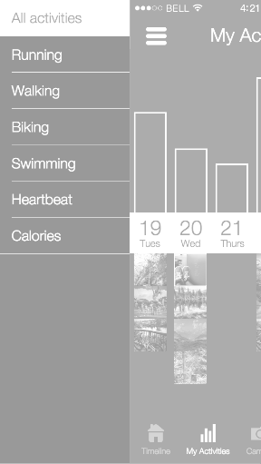
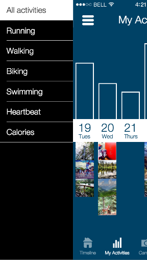


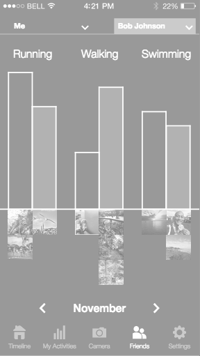

One of the hardest parts of conducting usability tests is finding the right users and recruiting them to give up some of their time. One approach we came up with was a survey to screen the category of users the potential user would fall in, such as extreme to minimal participation in self-tracking activities. To also confirm user needs were addressed and met, a usability test was created with each task emphasizing a certain need. Metrics of success were developed to ensure that the workflow was streamlined and intuitive, while concepts of the application were comprehensible.
