A mobile app that encourages volunteering by aggregating multiple micro-volunteering platforms and gamifying the volunteer activities
SKILLS: User interface design, Logo design, Prototyping
TOOLS: Sketch, Photoshop, Proto.io
Voluntopia was a mock project that was designed by a UX team at DESIGNATION as a solution for the following problem:
"How can we incentivize those who have had a positive volunteering experience with a service project to recruit and prepare others for new volunteering opportunities."
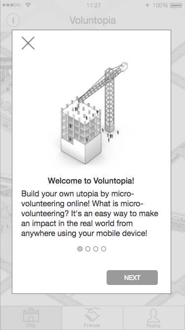
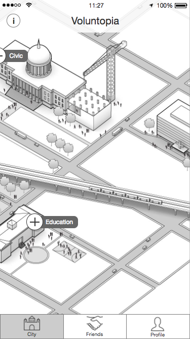
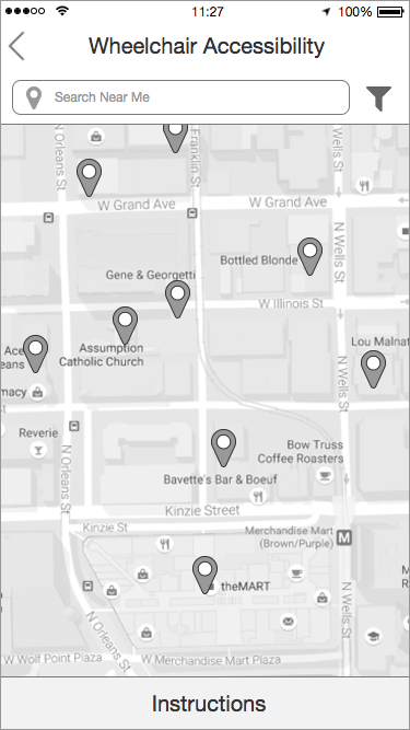
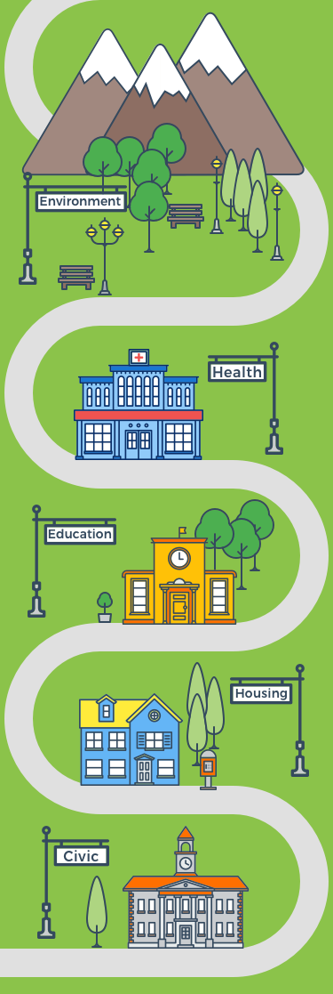
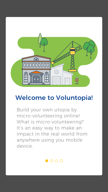
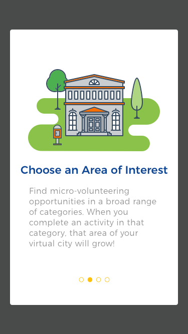
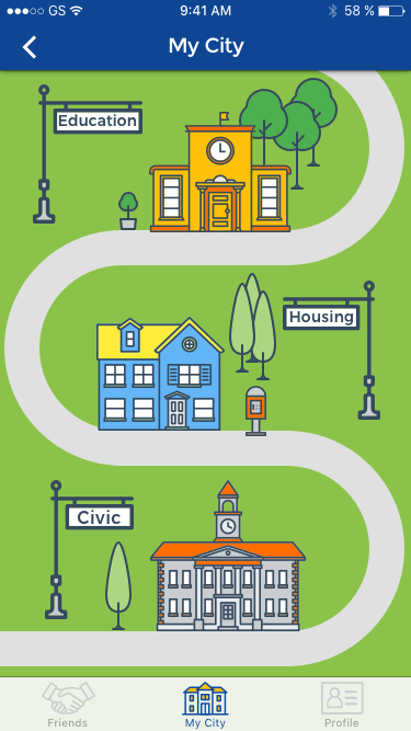
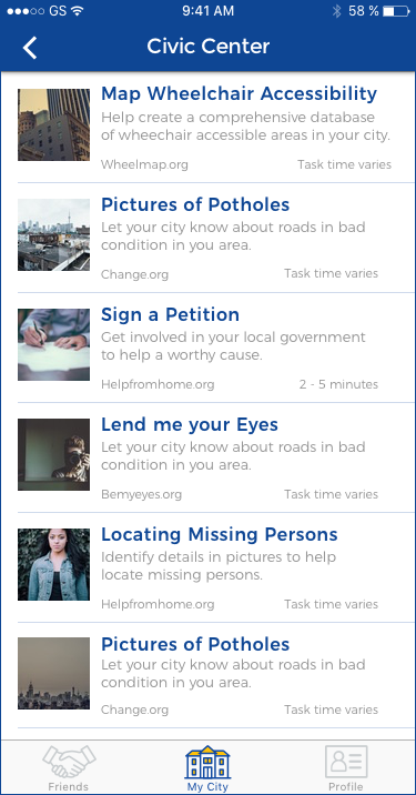
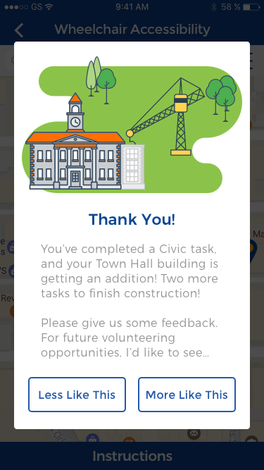
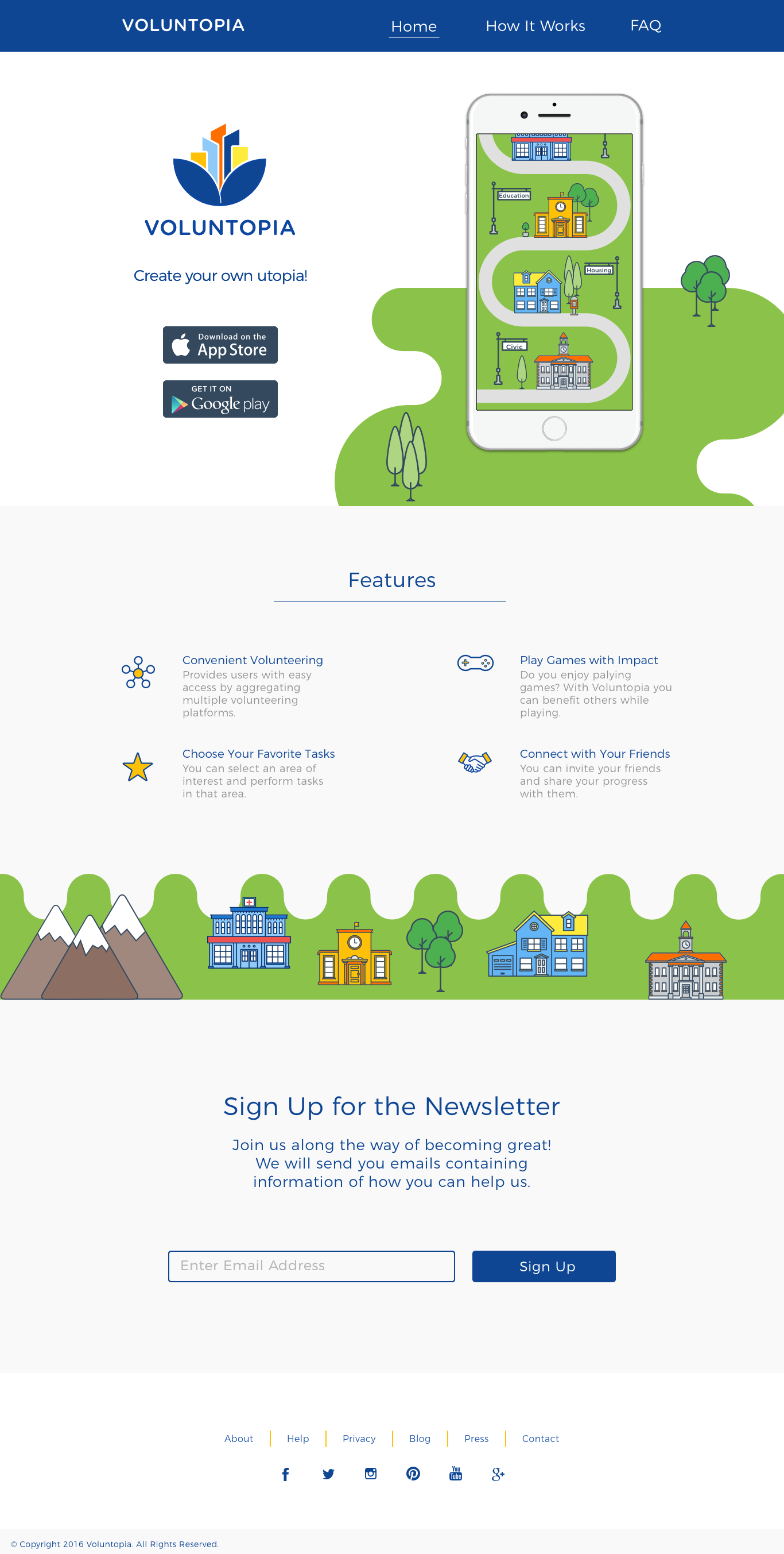
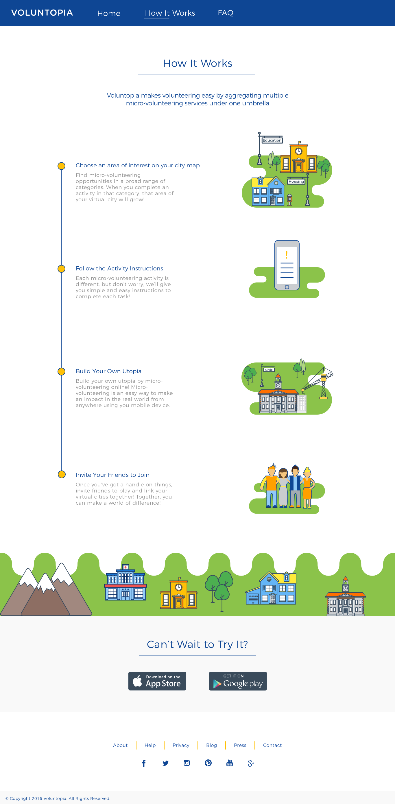
Voluntopia is a mobile app that allows users to perform online volunteering tasks using their mobile device. This is called micro-volunteering and it is usually done in small increments of time. Voluntopia aggregates several existing micro-volunteering platforms under one umbrella to provide the user with more choices and gamify the experience to increase engagement. Each user has a city (Voluntopia) that expands as they perform more volunteering tasks using the app. For example, if they help with identifying wheelchair accessibility issues of buildings in real life, the civic center building in their city receives an annex.
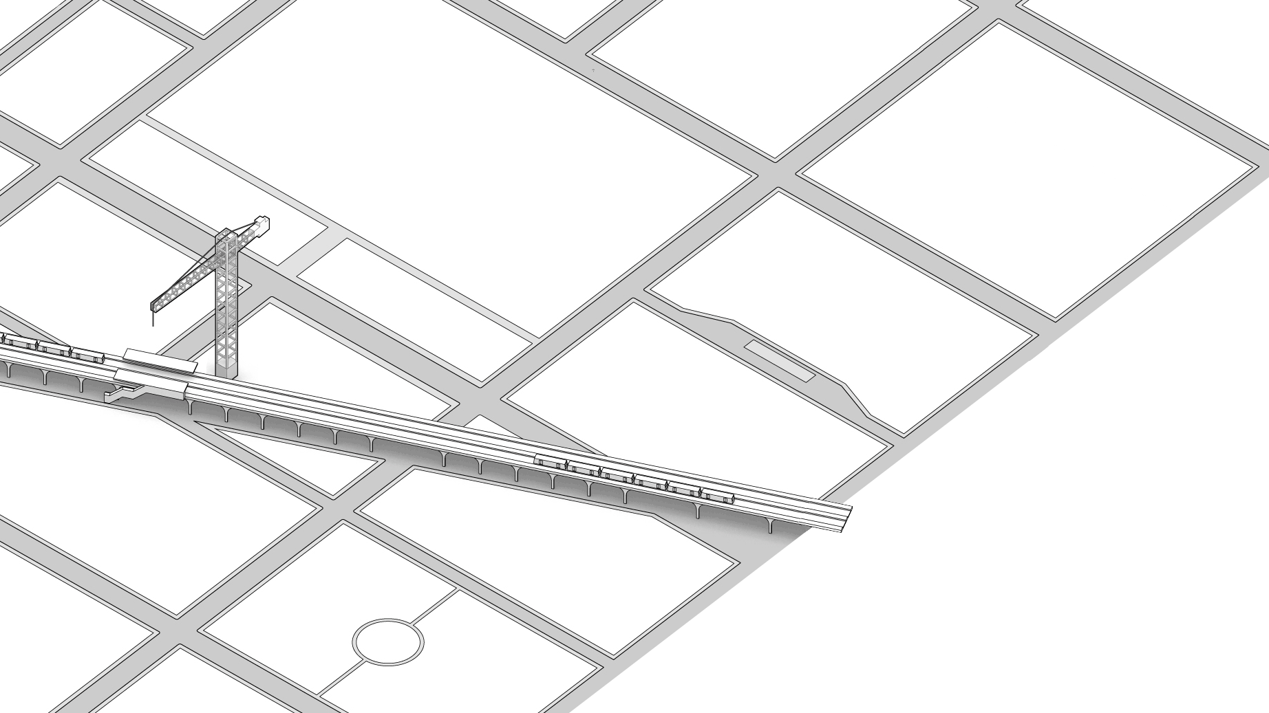
Wireframes featured a city (Voluntopia) that gets developed as the user performed more tasks.
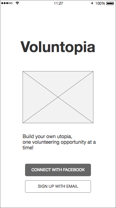
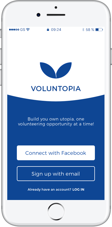
We started our work by examining the assets including the wireframes and user personas. The wireframes were made with attention to details and an emphasis on the onboarding process. I reviewed the wireframes and found some areas that could be improved. For example the "login" was missing on the first screen and "sign up" was the only available option.

"When I volunteer, I want to see the impact it has on the community."
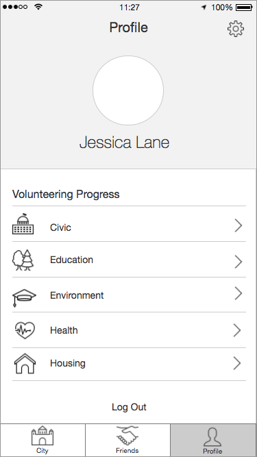
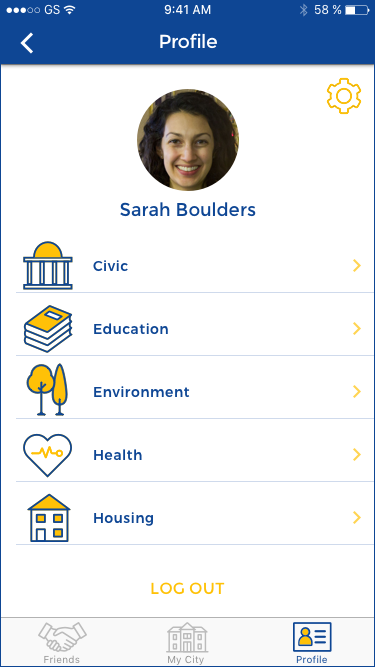
The primary user persona, Jessica, is a young college student who likes to donate her time and make a positive impact. However it is difficult for her to find appropriate volunteer opportunities that match her busy schedule. She volunteers for multiple reasons, including socializing with friends and family.
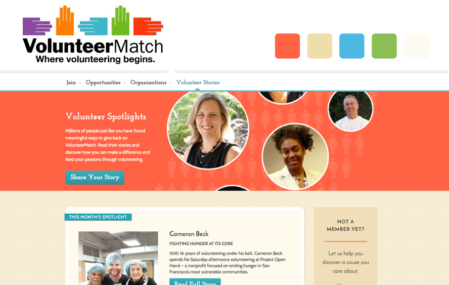
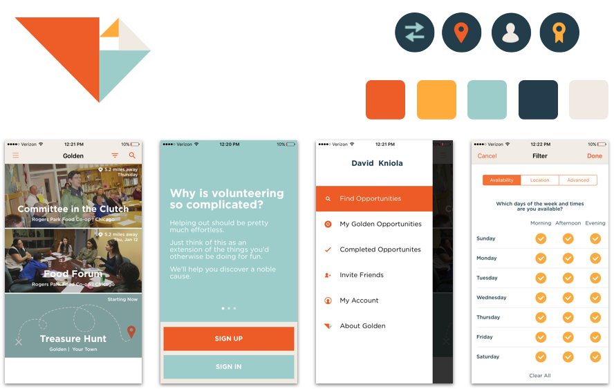
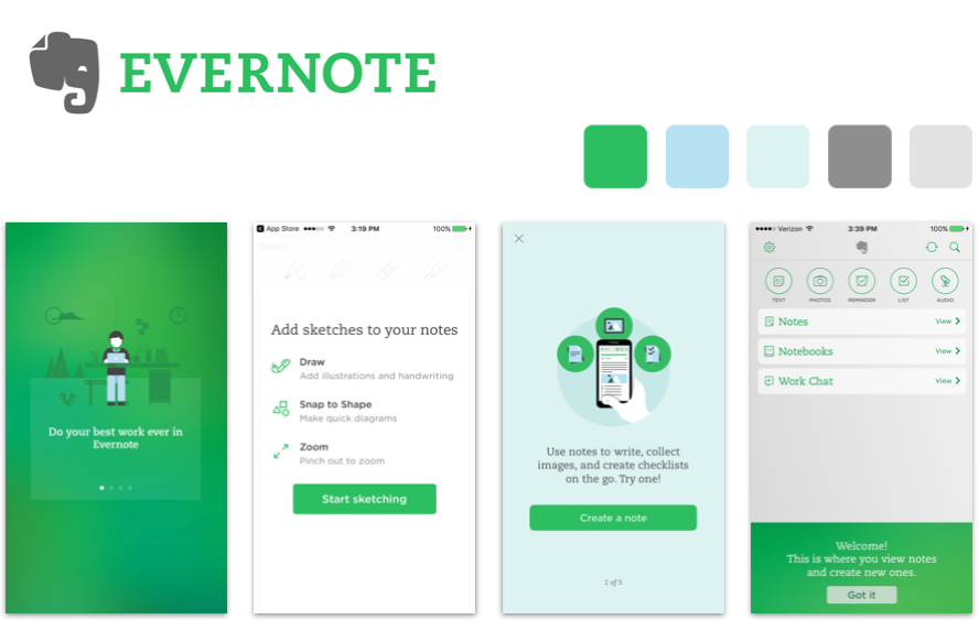
The second step was to research potential competitors to gain insight from their approach to branding, color, and other UI elements. We couldn't identify any other apps or websites that offered aggregated micro-volunteering; however, we looked into several volunteer matching services and some smaller scale micro-volunteering apps including: Volunteer Match, Mob, Golden, GiveGab, DoSomething, BeMyEyes and Elbi. We also analyzed a few apps such as Evernote, that didn't resemble Volunopia in terms of their area of focus, but targeted similar demographics.
After examining competitors and our user persona, I began to explore potential stylistic directions with mood boards. They helped me define the visual language and color palettes of the app. Based on the moodboard, I then created two style tiles to translate the aesthetic feel to more tangible UI elements and to communicate the essence of the visual brand.
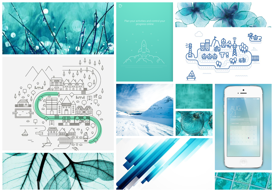
My first design leaned towards the use of a monochromatic aqua/turquoise color and stroked icons and UI elements. I used bright shades of blue to create a fresh yet trustworthy look and feel. Simple stroked buttons and icons made the design seem effortless and undemanding.
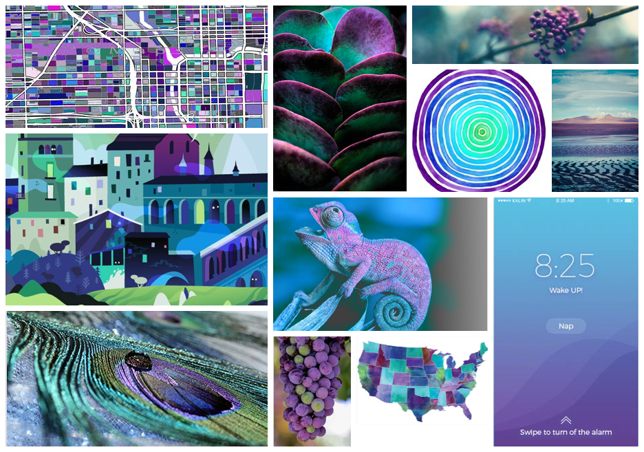
The second design incorporated hand drawn icons for the Voluntopia map and used purple, green and blue as primary colors. The shape of icons, colors, and Josefin Slab headings created a whimsical, somewhat mysterious and yet welcoming design.
After consulting with my creative director and receiving feedback from my peers, I noticed a strong preference for the first style tile; however the use of monochromatic aqua/turquoise color was deemed to make the design seem too cold. This wasn't appropriate for an app which was about volunteering. Based on this feedback I created a third style tile in which I kept most of the UI elements of the first style tile but added some warm colors into the mix. Thinking about Voluntopia's target users, I wanted to create something playful and engaging but at the same time trustworthy and safe. Based the those Ideas, I chose a color palette and style with blue as my primary color and gold as accent color.
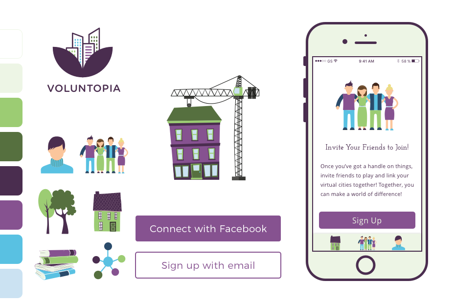
I revised the first concept by adding a darker blue and warm colors to make the design more friendly and welcoming.
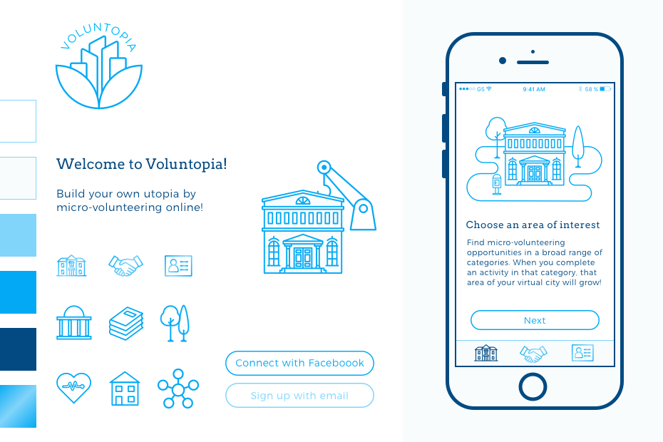
I had several ideas about the logo. Some of them involved illustrations of a crane, as the concept of building was important in Voluntopia. The other concept incorporated hands, which I realized was an overused concept, especially in this domain. The logo I ultimately decided to go with had an organic shape and represented growth, blossoming and togetherness.
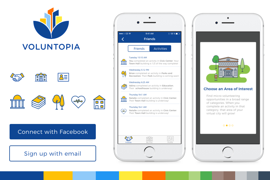
It was impossible to think about visual language of Voluntopia without considering the city map which was the most important feature of the app. Wireframes showed an isometric view of the city map, but after some discussion of the UX team, I realized they were open to other ideas for the map. I decided to find an alternative way of showing the map to differentiate Voluntopia from pure gaming apps like Farmville that use an isometric view of their landscape. I opted for a vertical scrolling map to set apart Voluntopia and make it easy for the user to move around the map using only one finger.
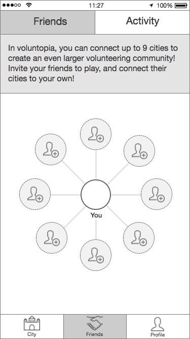
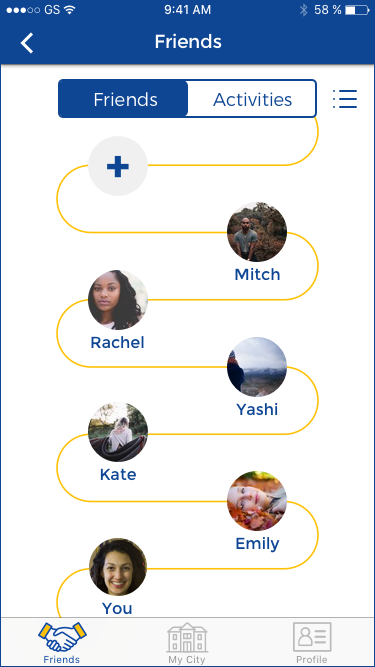
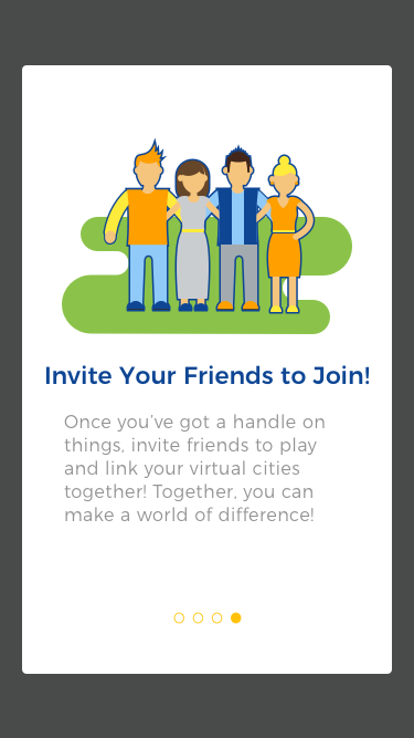
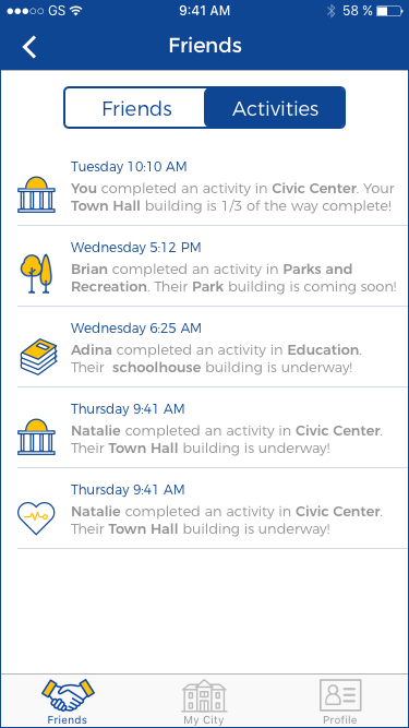
My different approach to visualize the map led to other changes in the wireframes. For example the original friend page limited the number of friends to eight, because each user can only have up to eight adjacent cities. This representation of friends was not consistent with my city map. So I created a diagram similar to the shape of the city map to show friends. However, as I was concerned about this unconventional portrayal, I created another familiar listview with a button so users can switch between the two views.
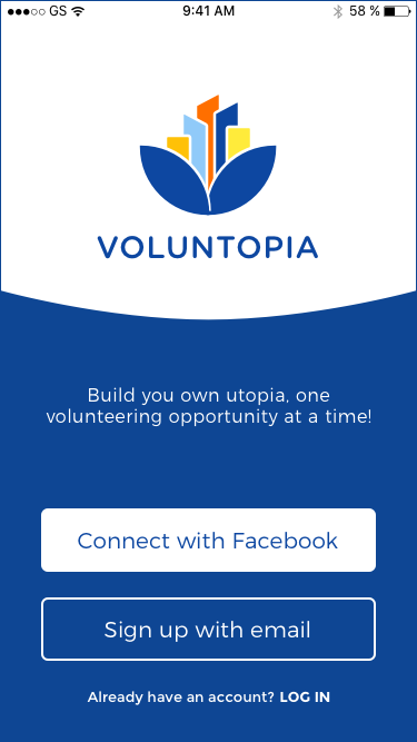
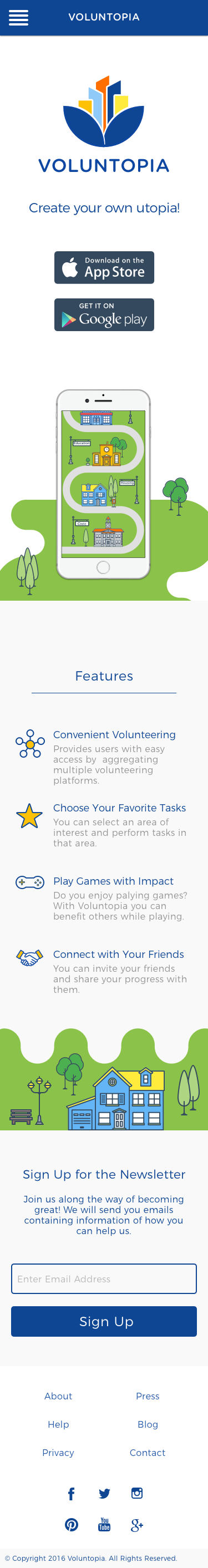
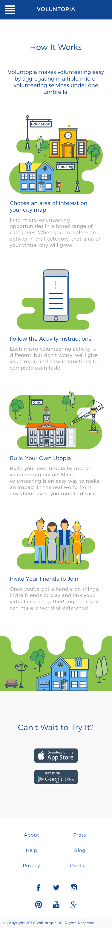
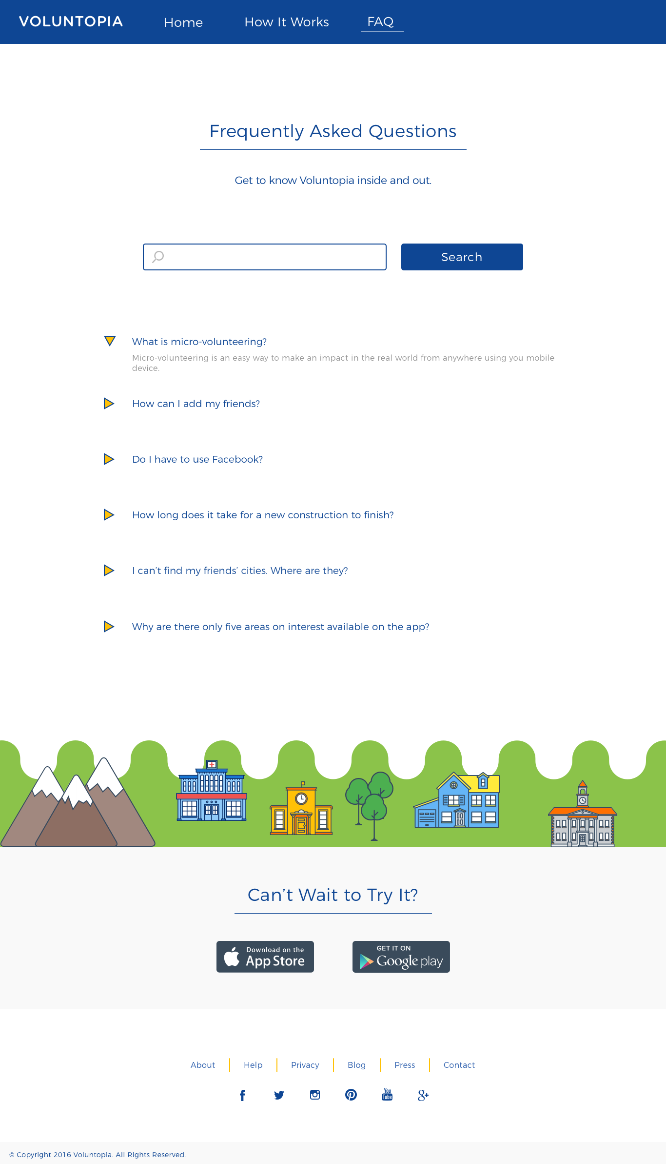
Finally, I created a responsive marketing page for desktop and mobile. I used similar UI elements and motifs that are used throughout the mobile application.
If I had more time to work on this project, I would have further explored the transitional stages of the city and the way it would look like after each "update". Also, I would have liked to explore how cities connect to each other and various ways they could be customized or be differentiated from one another.
 Marjan Ghahremani